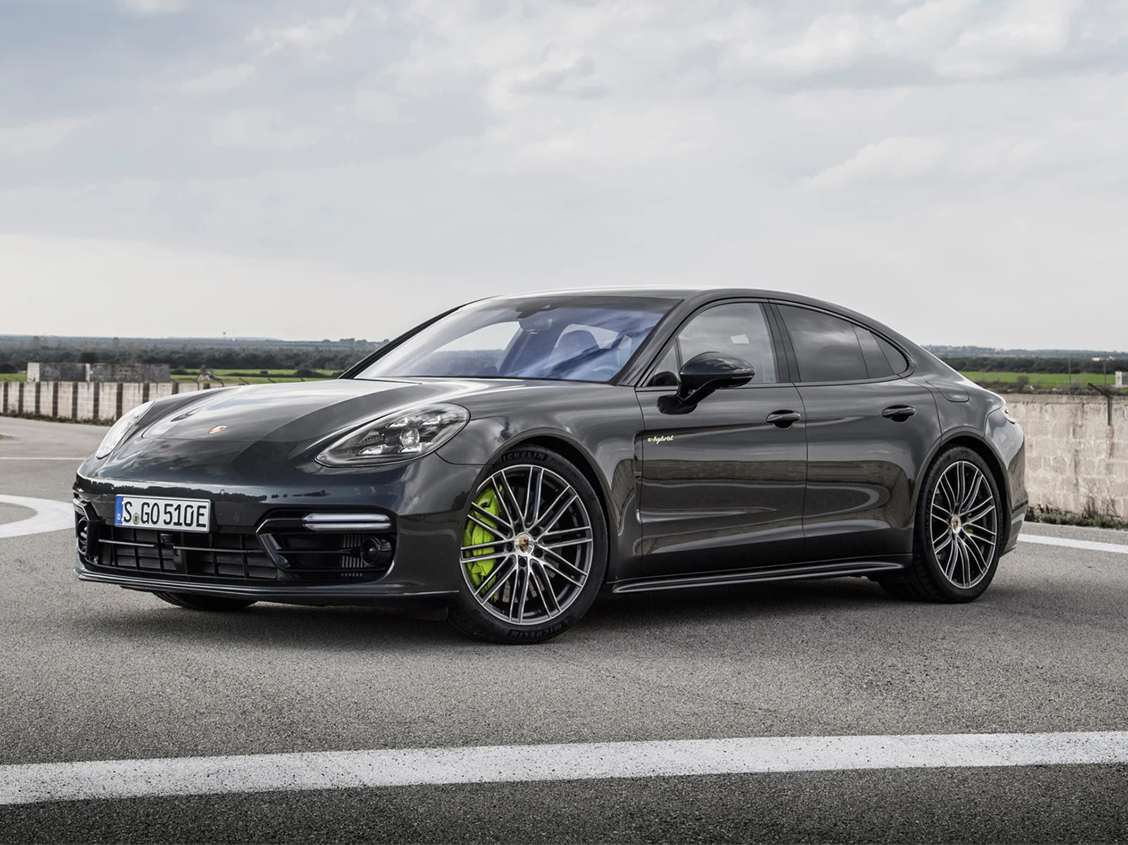
lush lawn + property enhancement
in addition to naming the company and design the logo, this letterpressed business card showcases exactly what lush is all about.
andrew bird
by turning andrew bird's home state of illinois into the heart that pumps the lifeblood into his north american tour i was able to show the level of care his music means to him. the gig poster was followed by details like the veins ending at every one of his shows and custom typography.
the ting tings
the ting tings are two people, jules and katie. jules is represented by cyan and katie, magenta. they met at an artists' community outside manchester, england, hence the overprinted cotton mill. while there, they were both in separate bands which is shown by the smoke/thought bubbles showing their different ideas of what music was to each of them. and finally, when they collided they formed the ting tings. this poster also called for completely custom typography.
yo la tengo
yo la tengo has a very etherial, homemade sound. for me, their music is a well-thought weaving of sounds. the typographic illustration spells the bands name and is complemented by a font designed specifically for this poster. although the design is simple, it is complemented by a split-fountain screen printing technique which result in every single poster being a little different. while i was at it, i figured i might as well print it in four different color schemes.
santigold
for santigold's appearance at the sasquatch music festival i followed her lead of mocking those who drop names and follow trends just for the sake of being cool. another custom typeface was designed to mimic a gold chain and was printed in gold and silver metallic inks to top things off.